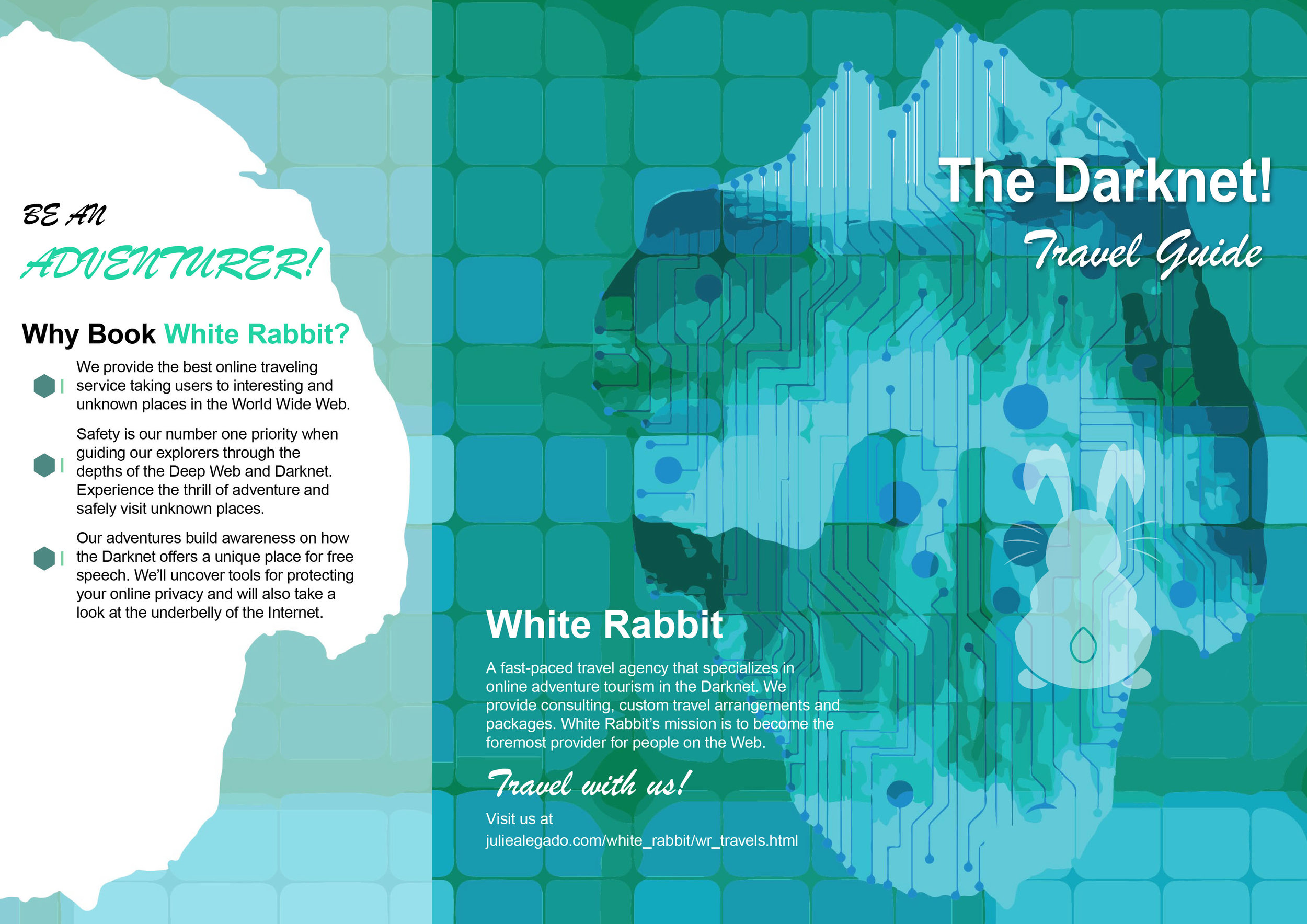
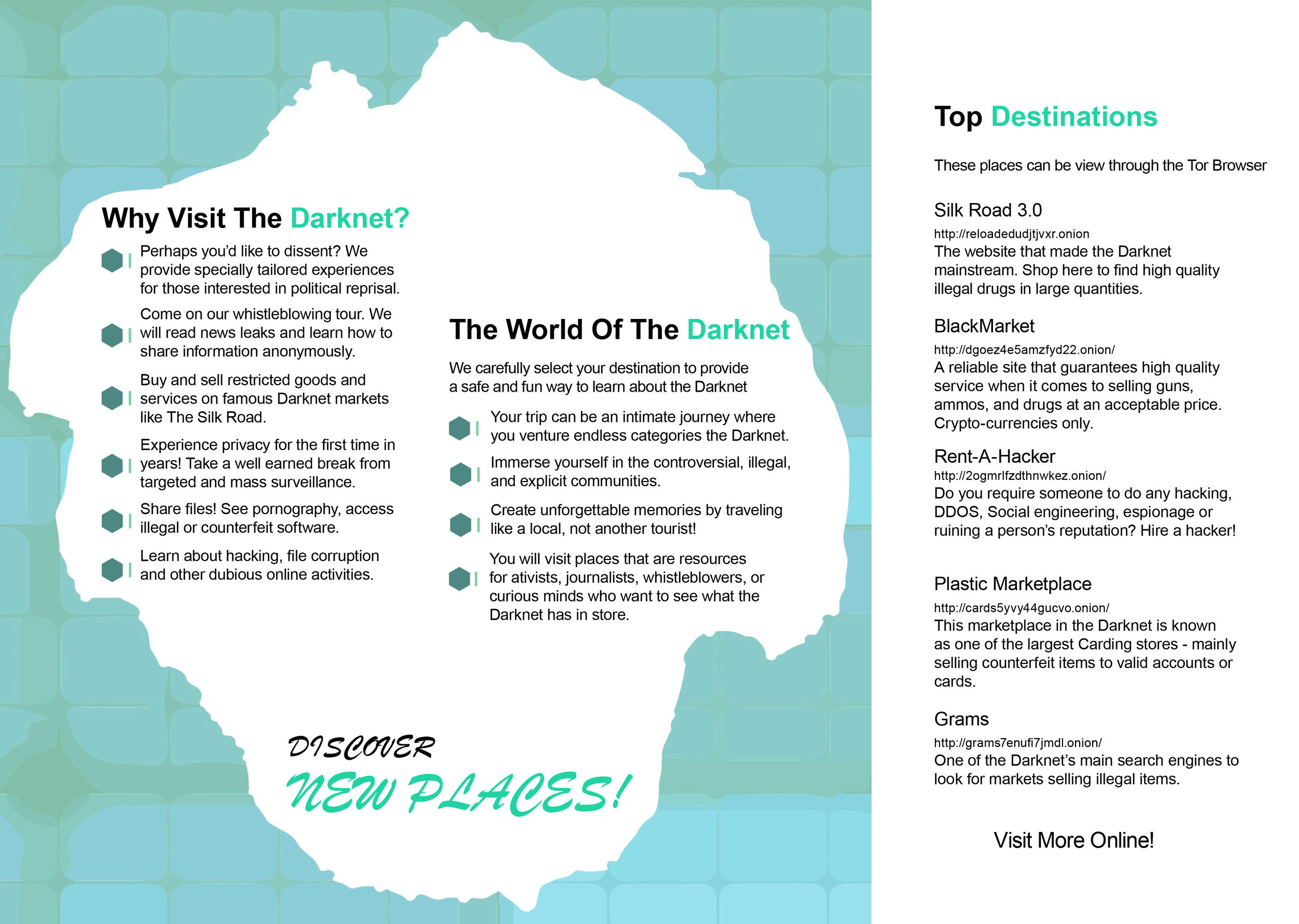
WHITE RABBIT
BRANDING:
White Rabbit is a fictional travel agency that explores the Darknet through a concept-driven, multi-platform experience. The project reframes a complex and often misunderstood system into an approachable, narrative-led journey, combining UX strategy, storytelling, and brand design.
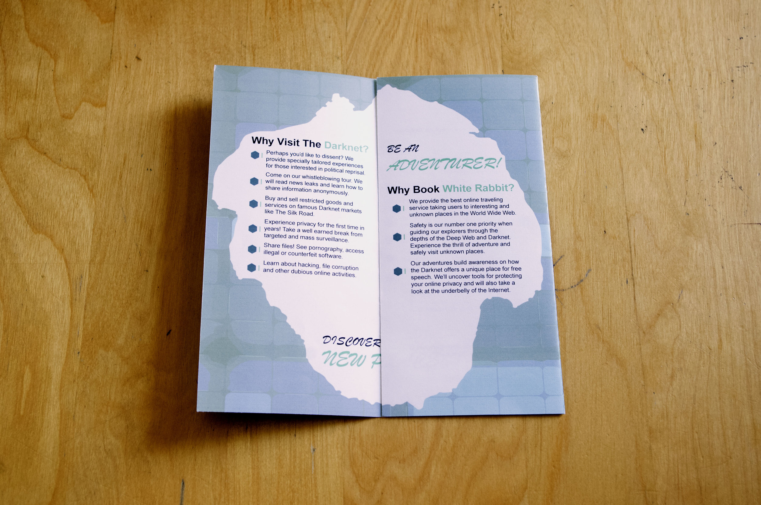
The goal was to educate and inform without sensationalism—using humor with honesty to present the realities of the Darknet while maintaining a strong sense of ethical, human-centered design.
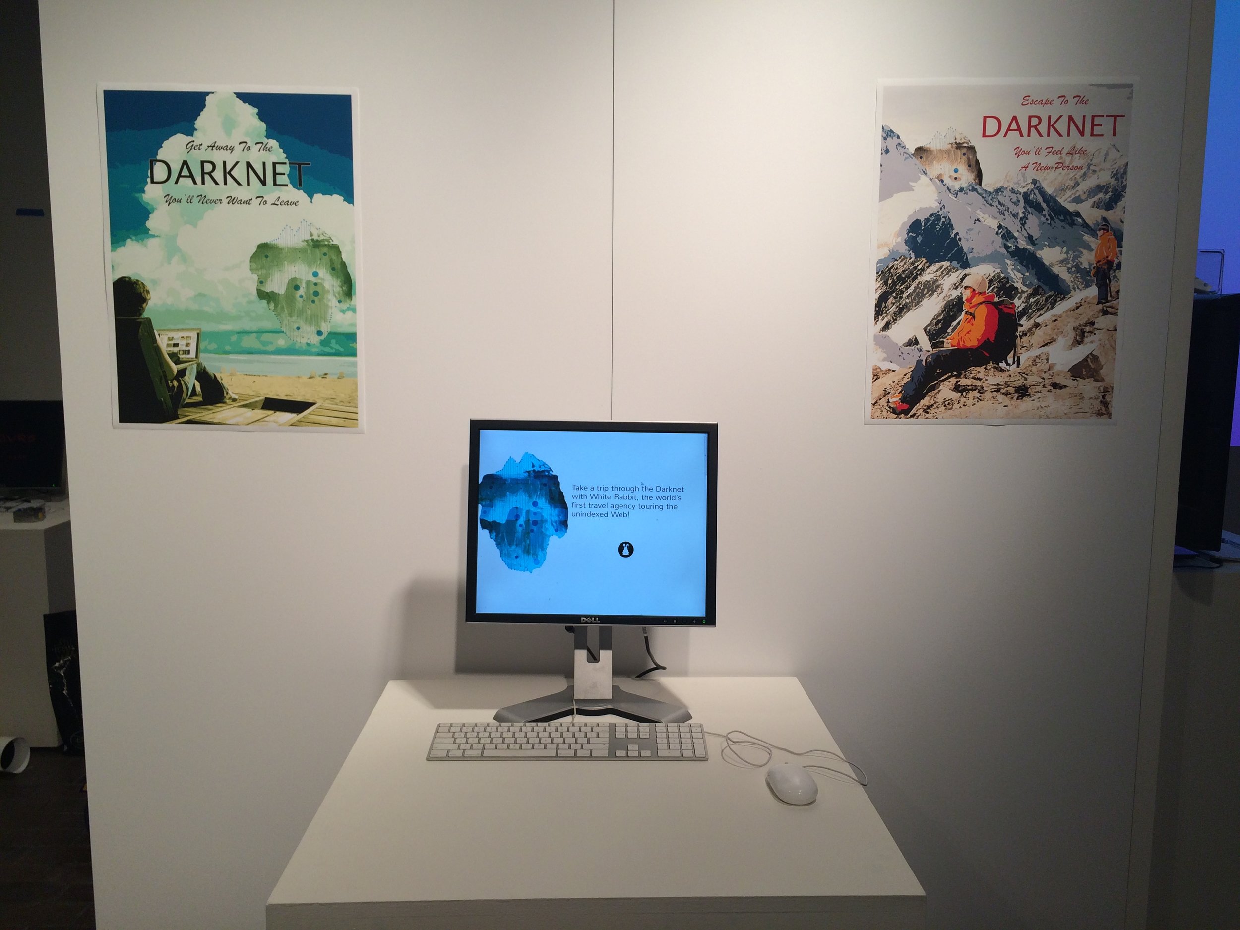
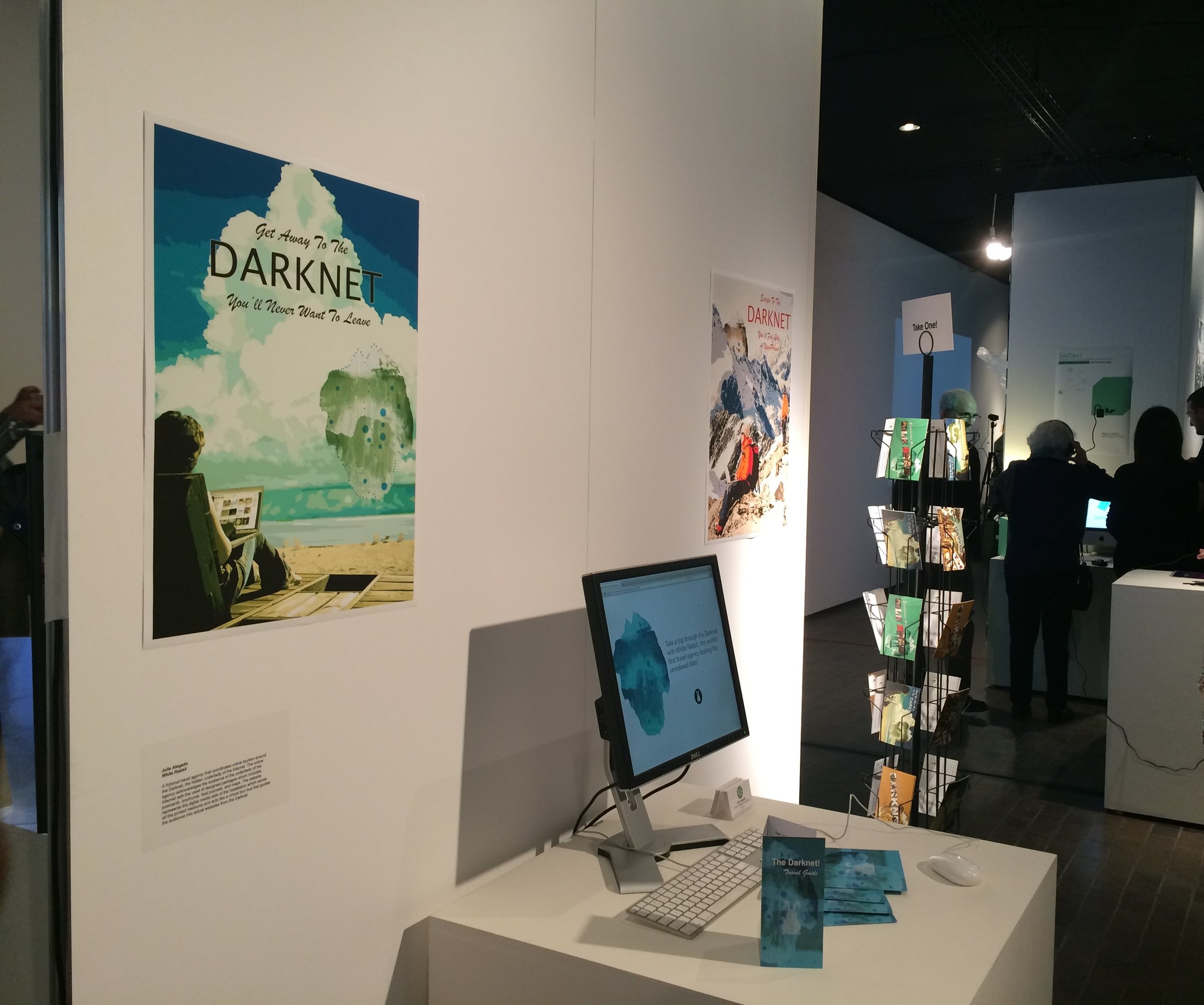
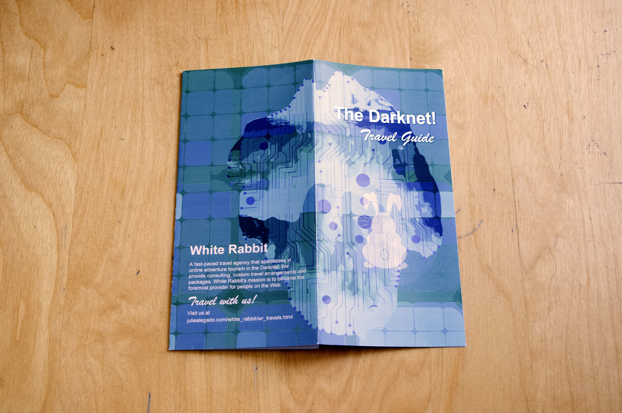
The experience spans a responsive website and a physical gallery installation, featuring print artifacts such as brochures, posters, and postcards, blurring the line between digital and physical touchpoints. Interactive web elements reference Tor-based environments, introducing intentional access limitations that reinforce themes of trust, restriction, and user agency, while remaining viewable on standard browsers.
Together, the project demonstrates how conceptual thinking, experience design, and strategic storytelling can coexist to create an immersive, cohesive, and memorable system.
DATE
2015-2016
ROLE
Graphic Designer
DELIVERABLES
Created a branding campaign by curating its typography, visual identity, and print materials—from posters to brochures—while also designing a website and a gallery exhibit to fully immerse audiences in its mysterious and unconventional experience.
CHALLENGES:
Defining a typographic system that captured the mystique and intrigue of the Darknet while maintaining legibility, hierarchy, and tone, balancing a comical yet informative voice.
Designing a logo identity that reflected Darknet exploration and whimsical tourism, carefully balancing mystery, cyber aesthetics, and playfulness without leaning into cliché or parody.
Establishing a cohesive visual identity that felt immersive, approachable, and on-brand, while clearly communicating the concept of darknet tourism without alienating or confusing users unfamiliar with the subject matter.
GOALS & METRICS:
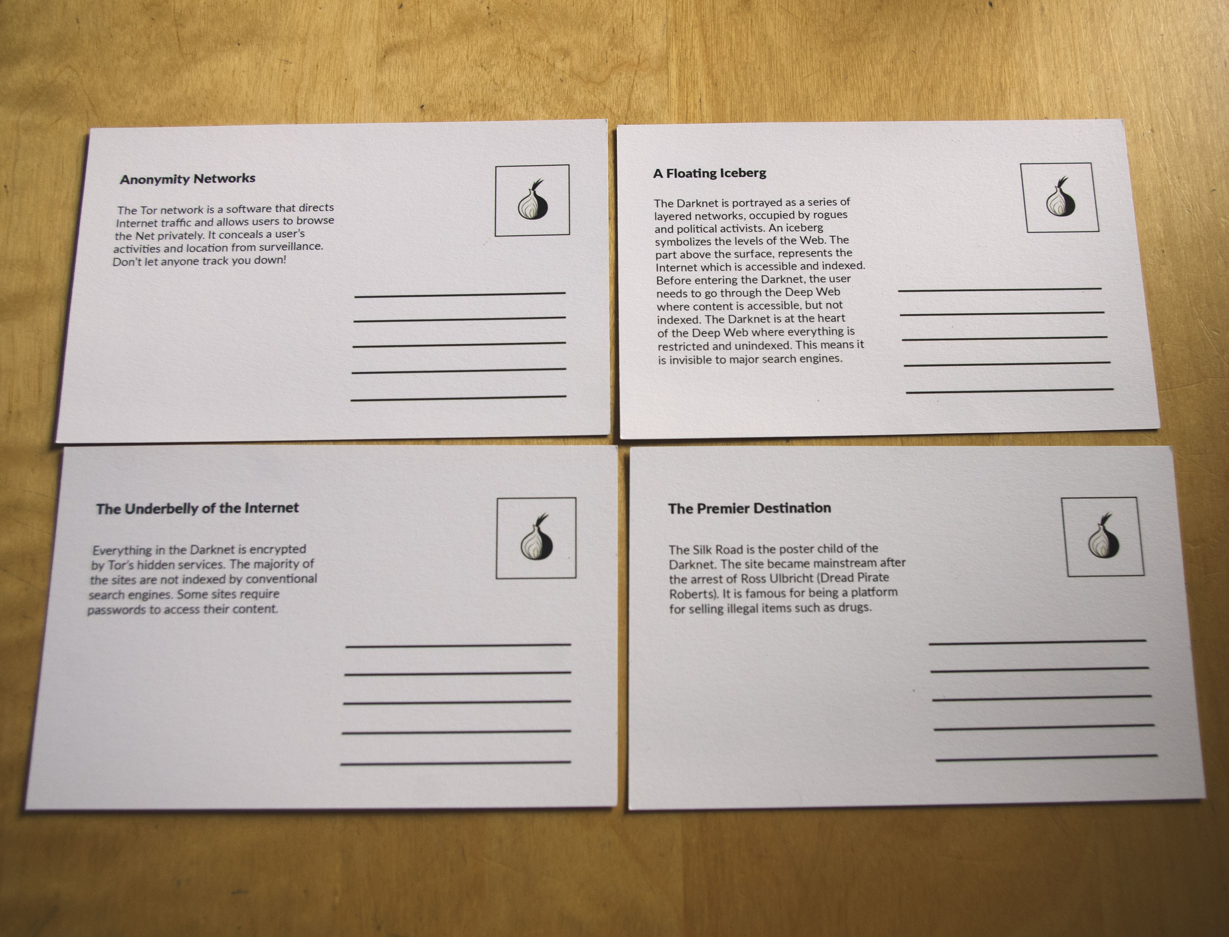
Translate complex, technical concepts related to the Darknet into engaging, digestible, and entertaining content across digital and physical formats, including the website, brochures, and posters.
Ensure a consistent and unified design system across all touchpoints, maintaining functionality, interactivity, and visual intrigue in both the website and physical materials.
Create an immersive exhibit experience that informed and entertained, using visual storytelling, interaction, and tangible takeaways to deepen user engagement and understanding.
Develop a memorable, on-theme souvenir that extended the experience beyond the exhibit, reinforcing the concept of darknet tourism and leaving visitors with a lasting brand impression.
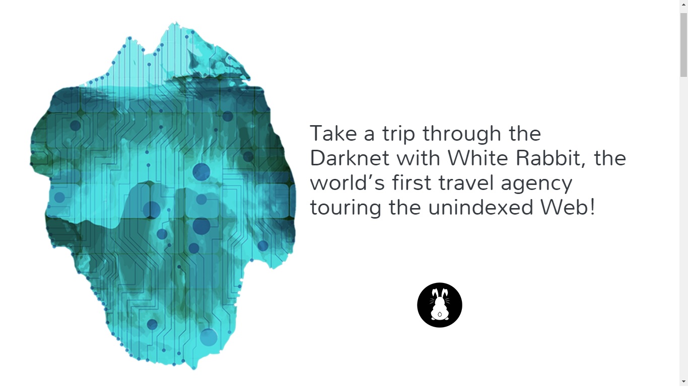
A tongue-in-cheek tourism campaign that turns the enigmatic Darknet into a thrilling, comical, and visually captivating adventure.
The various designs that went behind the making of the logo.
LOGO EXPLORATION & EVOLUTION:
As the designer behind this fictional darknet tourism service, I explored a range of logo concepts that balanced mystery, anonymity, and curiosity—core themes of guiding users through the Dark Web. The logo exploration documents an iterative design process, beginning with playful, symbolic concepts—such as a hidden face (Version 1) and rabbit ears emerging from a portal (Version 2)—and progressing toward more abstract, refined silhouettes (Versions 3 and 4).
Each iteration refined the visual language and tone, moving closer to a brand identity that felt dark, intriguing, and subtly surreal without becoming intimidating or overly literal.
The final logo presents the rabbit from a full back-facing perspective, a deliberate choice that humanizes the character while preserving anonymity. This approach reinforces the project’s central theme: exploring the unknown with guided curiosity, inviting users forward without revealing everything at once.
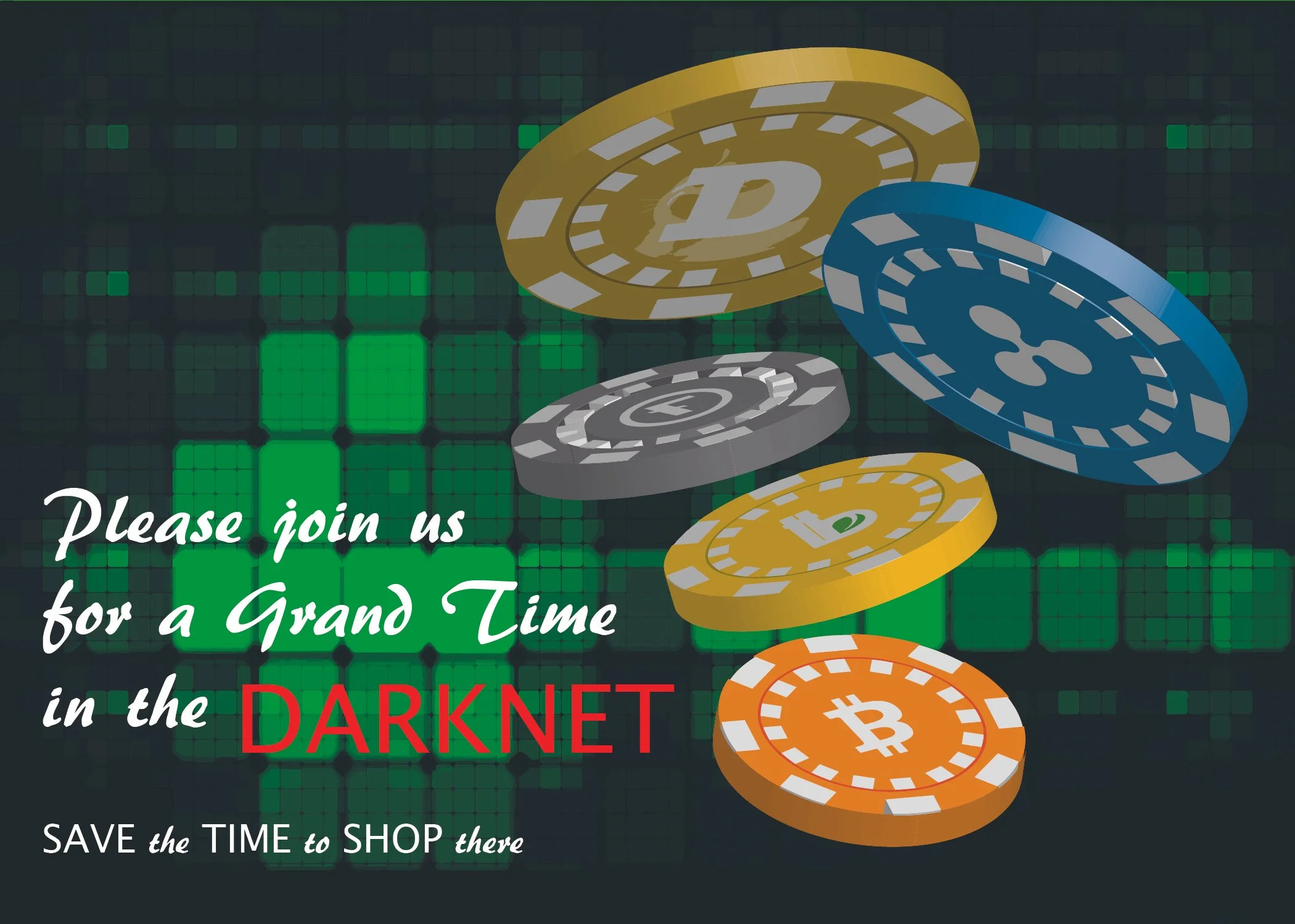
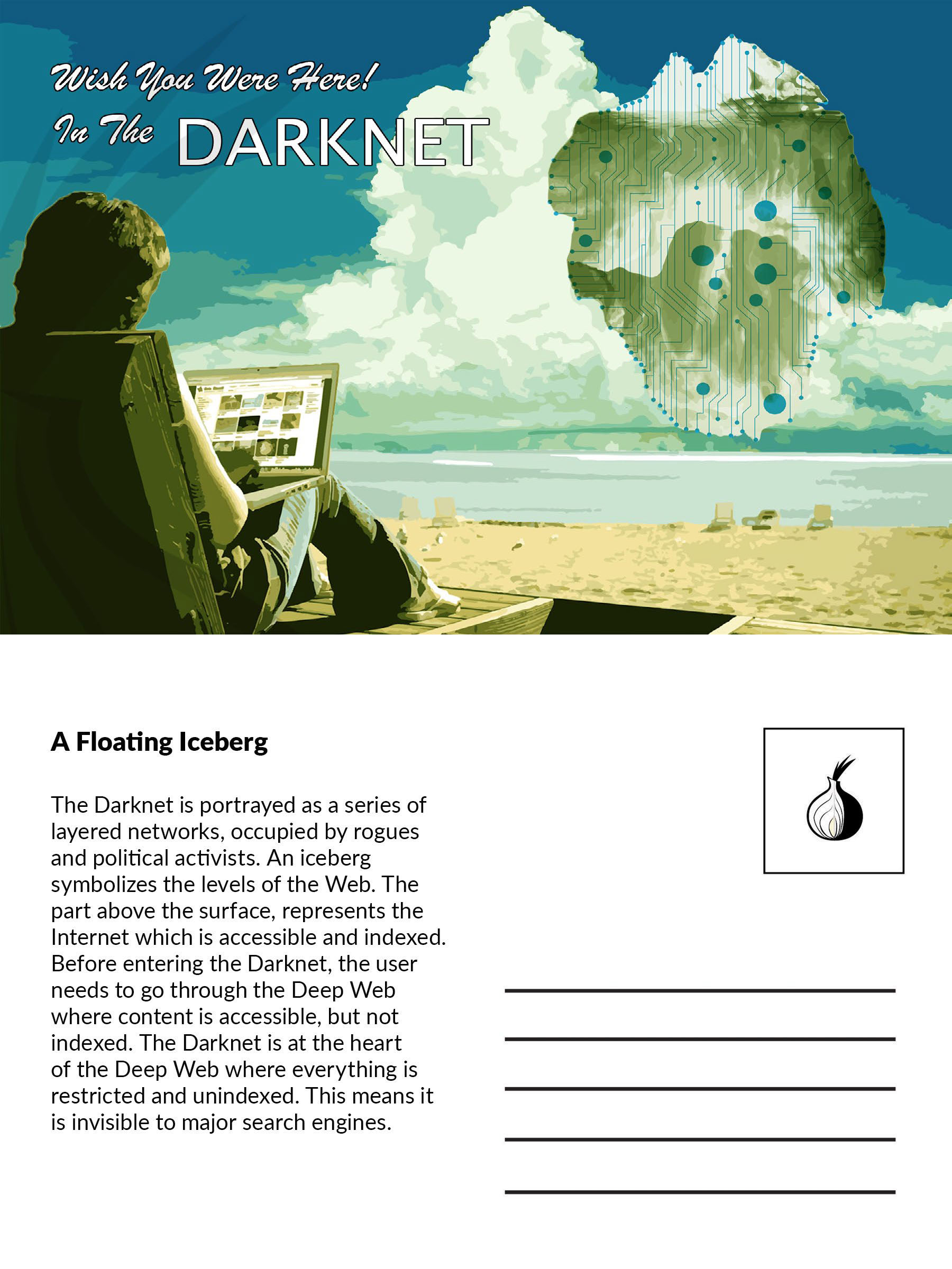
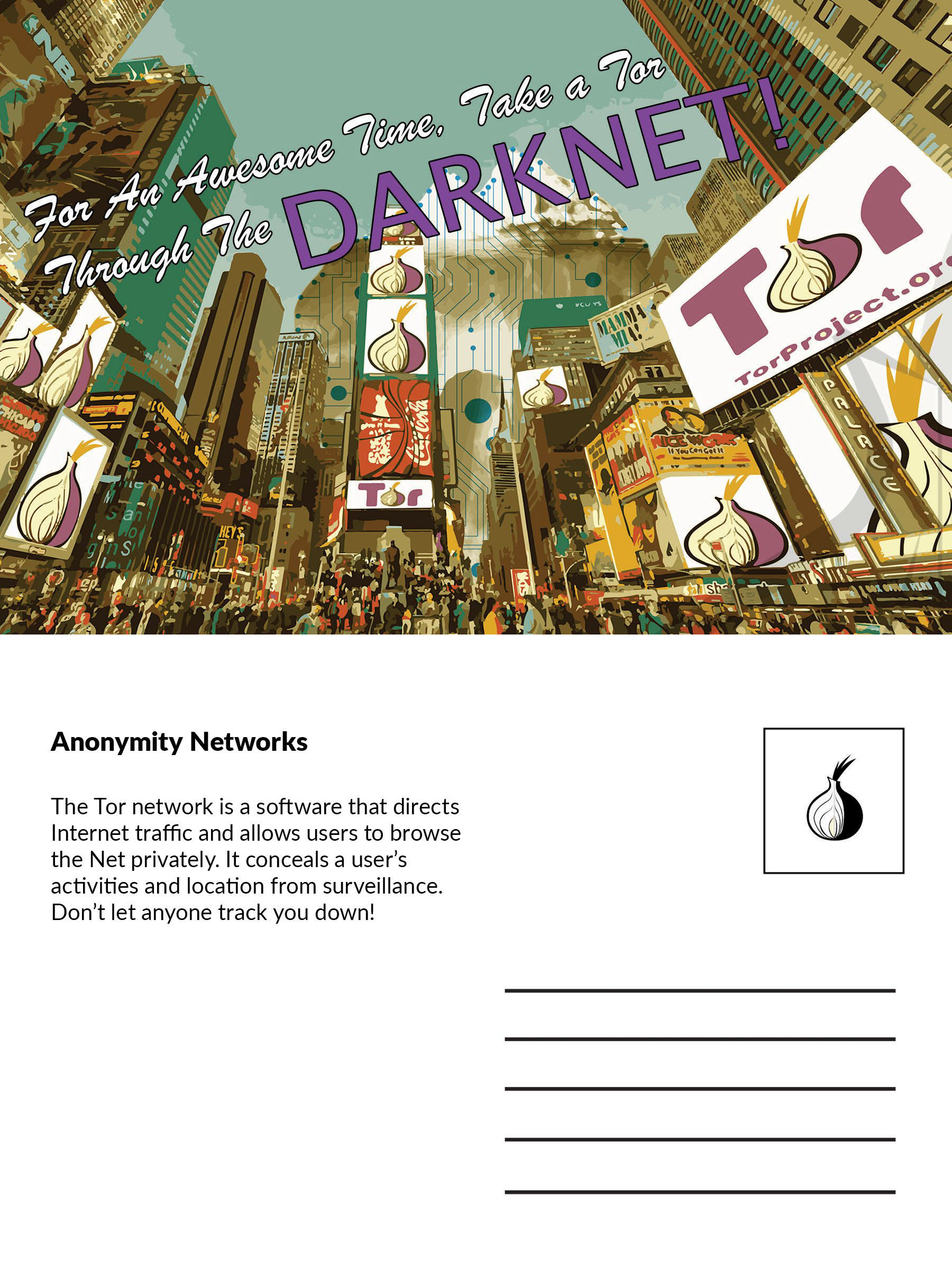
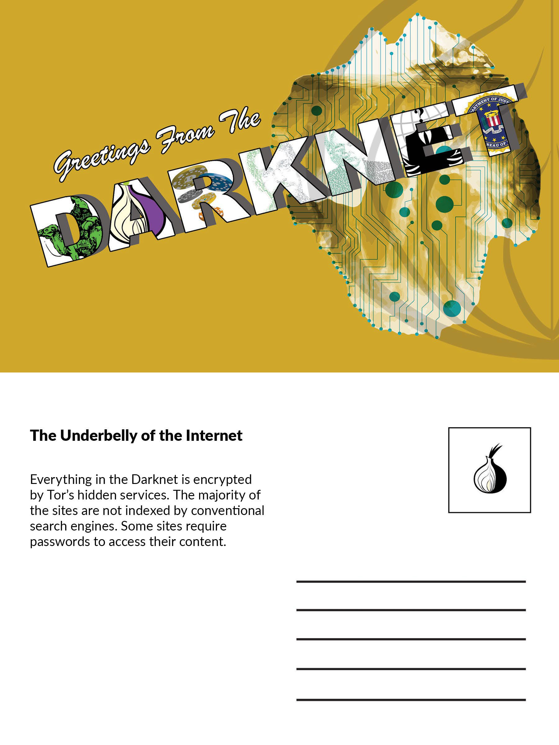
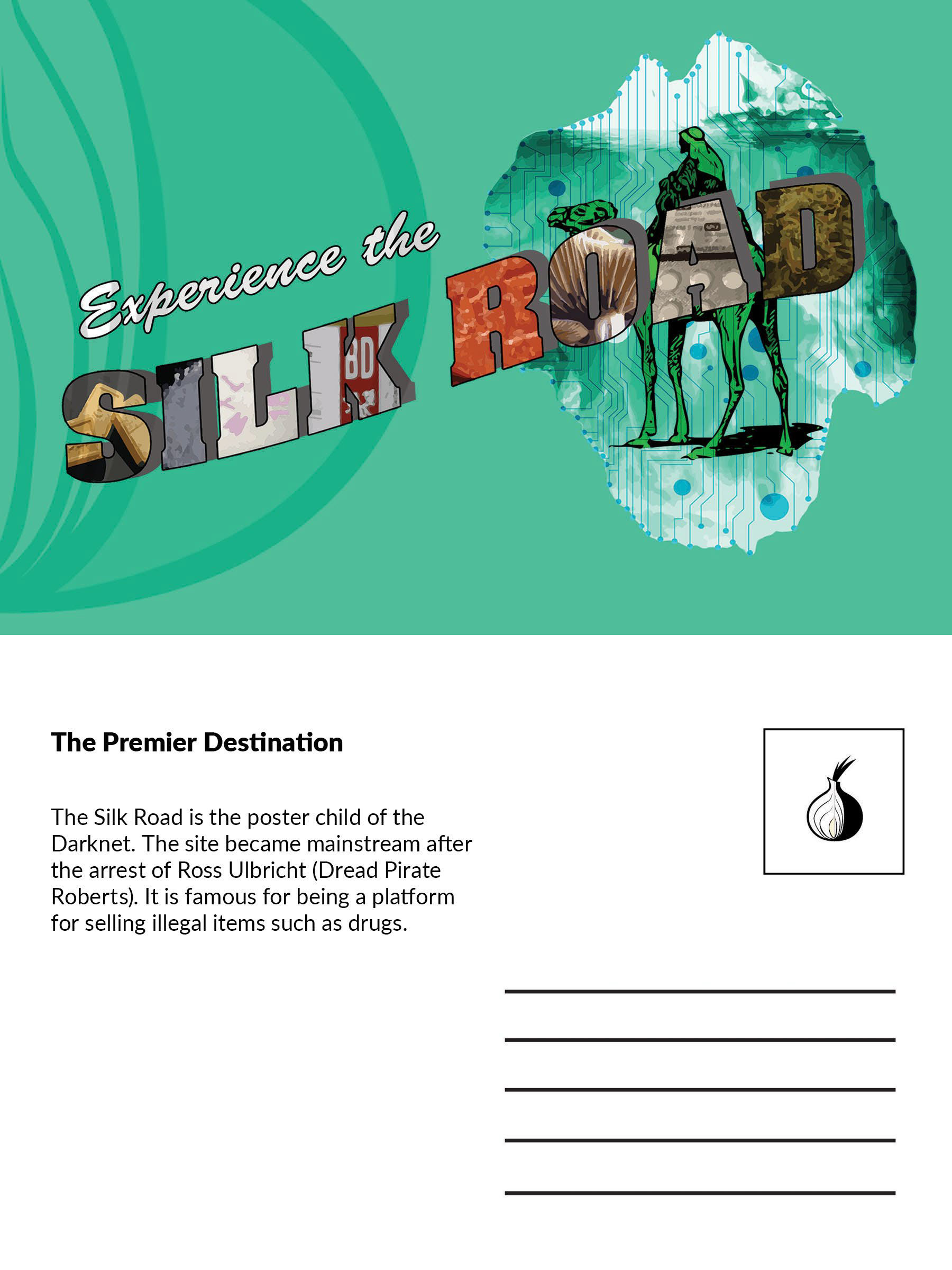
Two Samples of earlier designs for the postcard collection.
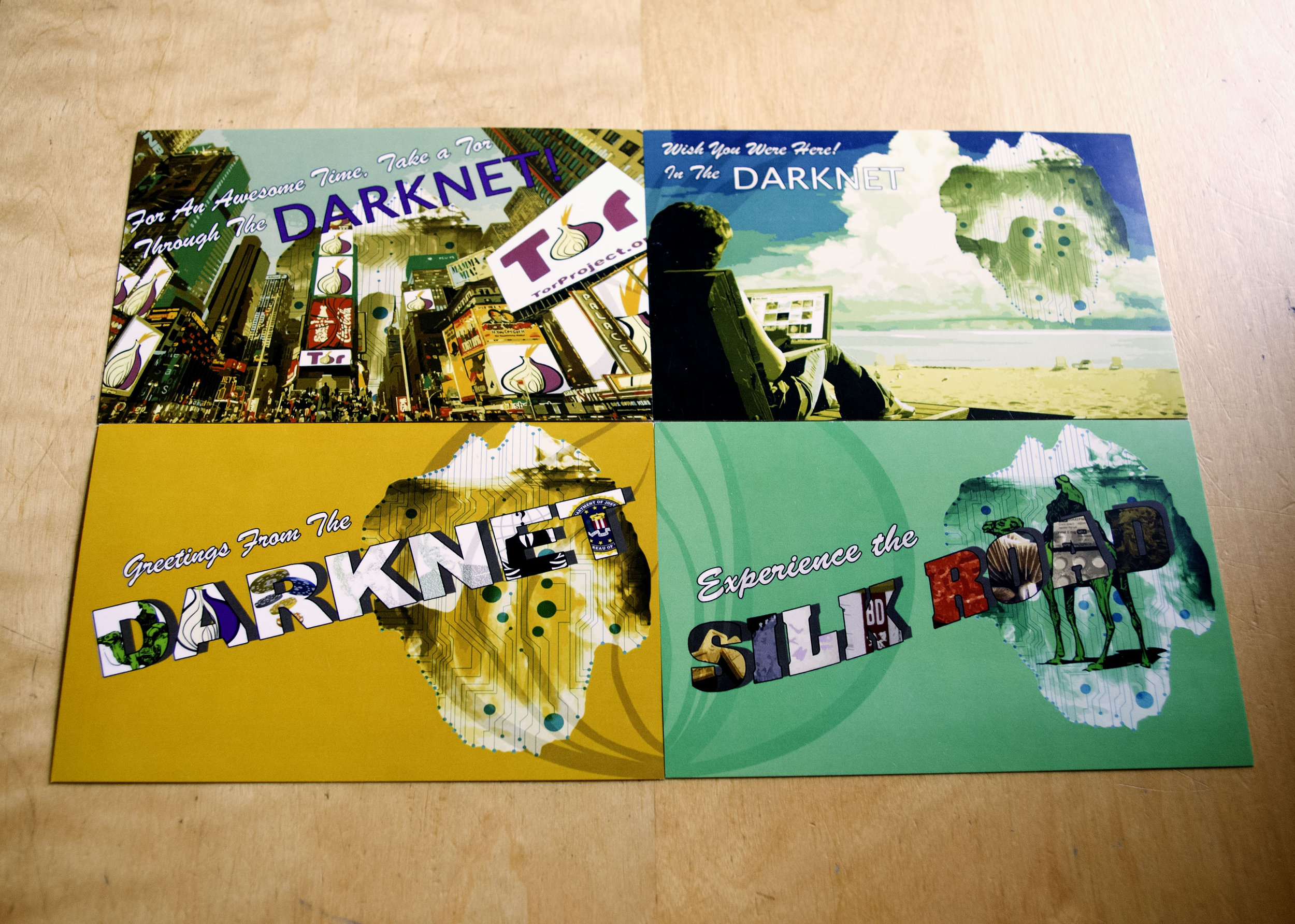
POSTCARD DESIGN EXPLORATION:
For this fictional darknet tourism service, I explored multiple visual directions while designing a series of campaign postcards intended to function as both marketing artifacts and experiential souvenirs. The process began with loose exploratory sketches that emphasized mystery and anonymity, before expanding into abstract, layered compositions featuring bold color, glitch effects, and complex visual textures—reflecting the chaotic, fragmented nature of the Darknet.
Through iteration, the designs were gradually refined and simplified, stripping away excess elements to arrive at a final direction that felt playful yet unsettling, eerie but approachable. The resulting postcards balance visual intrigue with clarity, ensuring they remain inviting, legible, and on-brand.
Designed to feel like souvenirs from a place you’re not supposed to visit, the postcards reinforce the project’s themes of curiosity, tension, and forbidden exploration, extending the experience beyond the digital space.
Scroll below to explore the design evolution and see how each iteration contributed to the final visual system.


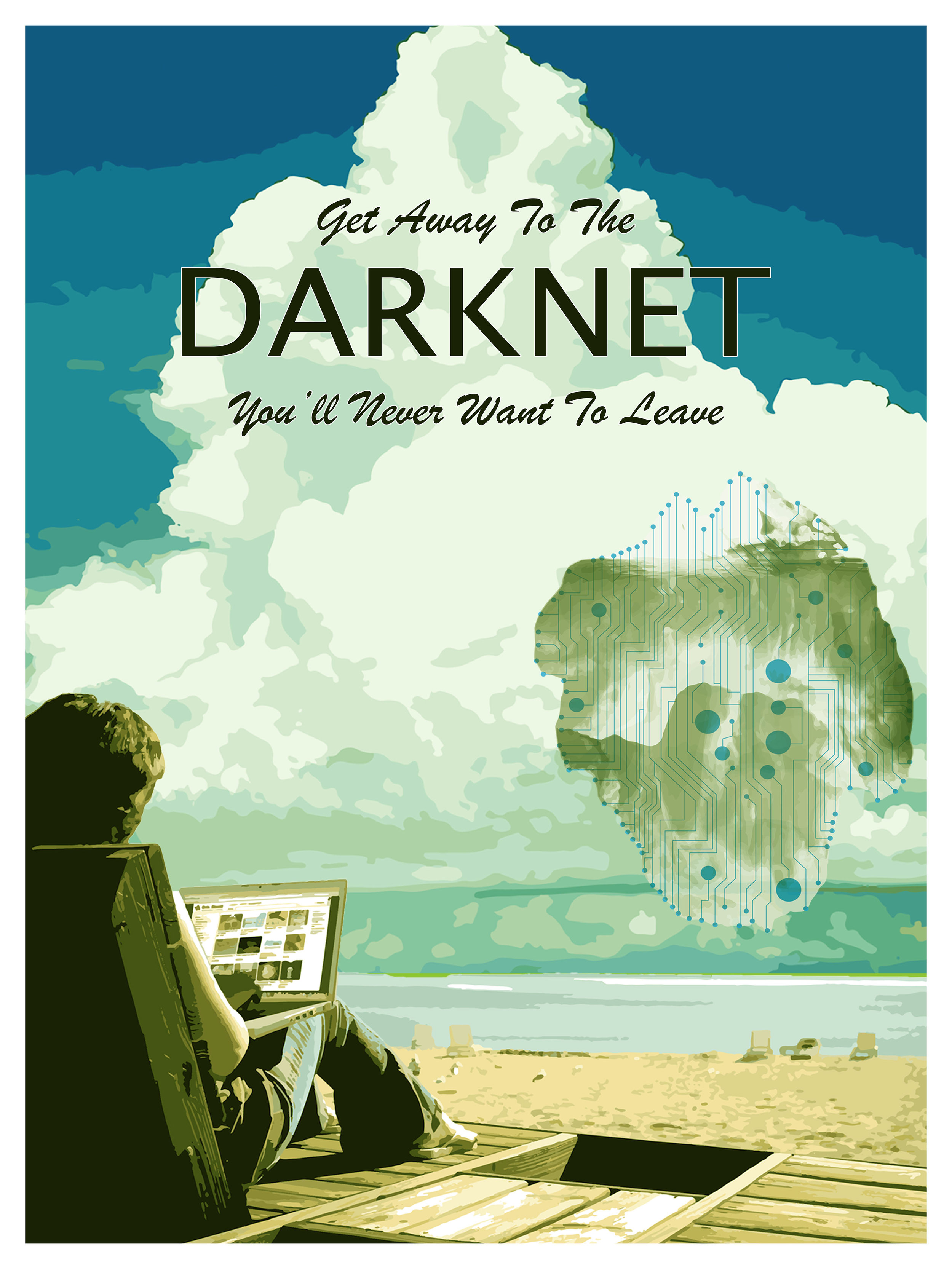
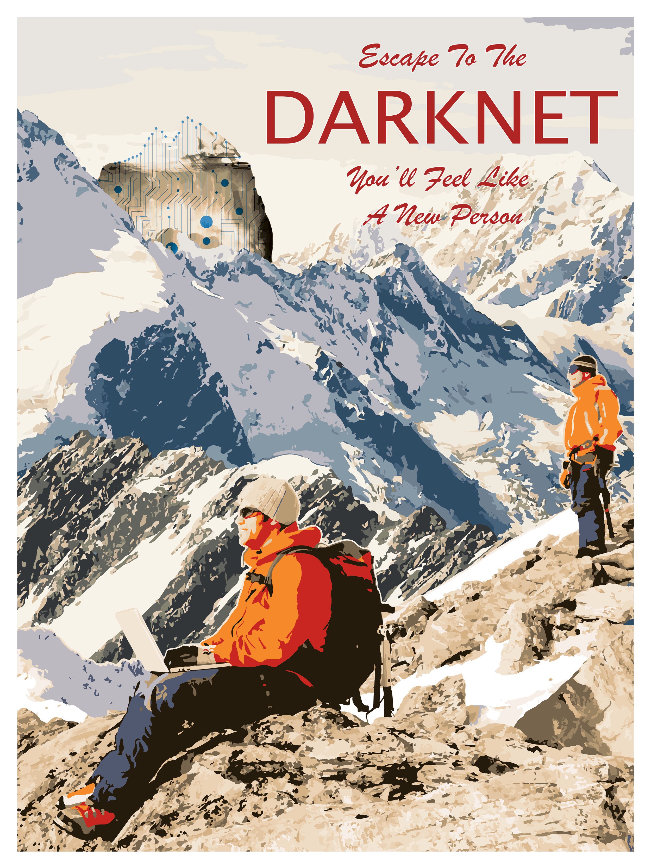
POSTER DESIGN EXPLORATION:
Designing posters for this fictional darknet tourism service was an exercise in exploration, experimentation, and refinement. Early concepts pushed the boundaries of visual storytelling, incorporating cryptic typography, shadowed figures, glitch aesthetics, and surreal compositions to suggest the unknown and unseen nature of the Darknet.
Throughout the process, I explored multiple visual directions to balance curiosity with caution, iterating on layout, color systems, and recurring motifs to ensure each design aligned with the brand’s mysterious yet approachable tone.
Following multiple iteration and feedback cycles, the collection was distilled into two final poster designs, each selected for its ability to spark intrigue, communicate narrative, and encapsulate the experience of venturing into the hidden corners of the internet.
Examples of early drafts for the poster pieces for this project.
-
![]()
Undoing Ruin
-
![]()
Nerd-Mart
-
![]()
Company Glow-Up
-
![]()
Lights, Camera, Posters!


