White rabbit
OVERVIEW:
White Rabbit is a fictional travel agency specializing in Darknet adventure tourism, offering customized travel experiences, consulting services, and curated packages for visitors exploring the hidden corners of the internet.
Through satirical branding, visual storytelling, and experiential design, the project explores the mysterious and often misunderstood world of the Darknet, using humor and transparency to educate audiences without overlooking its darker realities.
DATE
Fall 2015 - Spring 2016
ROLE
Brand Designer
DELIVERABLES
Brand Identity • Typography • Print Design • Posters • Brochures • Postcards • Web Design • Exhibition Design
AN UNCONVENTIONAL TRAVEL EXPERIENCE THAT BLURS THE LINE BETWEEN THE PHYSICAL AND DIGITAL WORLDS.
CHALLENGES:
Selecting typefaces that captured the mystery and intrigue of the Darknet while maintaining readability and reflecting the brand's playful yet informative tone.
Developing a distinctive logo and visual identity that balanced cyber aesthetics, mystery, and whimsical tourism without relying on clichés.
Creating a cohesive and immersive brand experience that communicated the concept of Darknet tourism while remaining approachable, engaging, and accessible to audiences.
DESIGN GOALS:
Translate complex information about the Darknet into engaging, digestible, and entertaining content across websites, brochures, posters, and other printed materials.
Establish a consistent visual identity across digital and physical media, ensuring the website, promotional materials, and exhibition worked together as one cohesive experience.
Design an immersive gallery installation that combined visual storytelling, interactive elements, and printed takeaways to educate and entertain visitors.
Create a memorable, themed souvenir that reinforced the fictional travel experience and left visitors with a lasting impression of the White Rabbit brand.
Logo Exploration & Development:
The logo began with exploring visual concepts that balanced mystery, anonymity, and playful tourism. Early iterations incorporated rabbit ears, concealed identities, and minimalist shapes to reflect the brand's unconventional identity.
Through multiple design iterations, the logo evolved from detailed illustrations into a simplified, recognizable symbol, combining a rabbit silhouette with a bold circular composition to establish a distinctive and memorable brand identity.
Logo exploration showcasing initial concepts to the final version.
Postcard Design & Exploration:
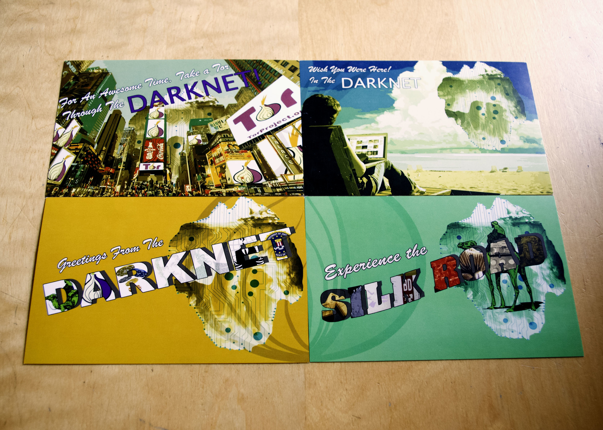
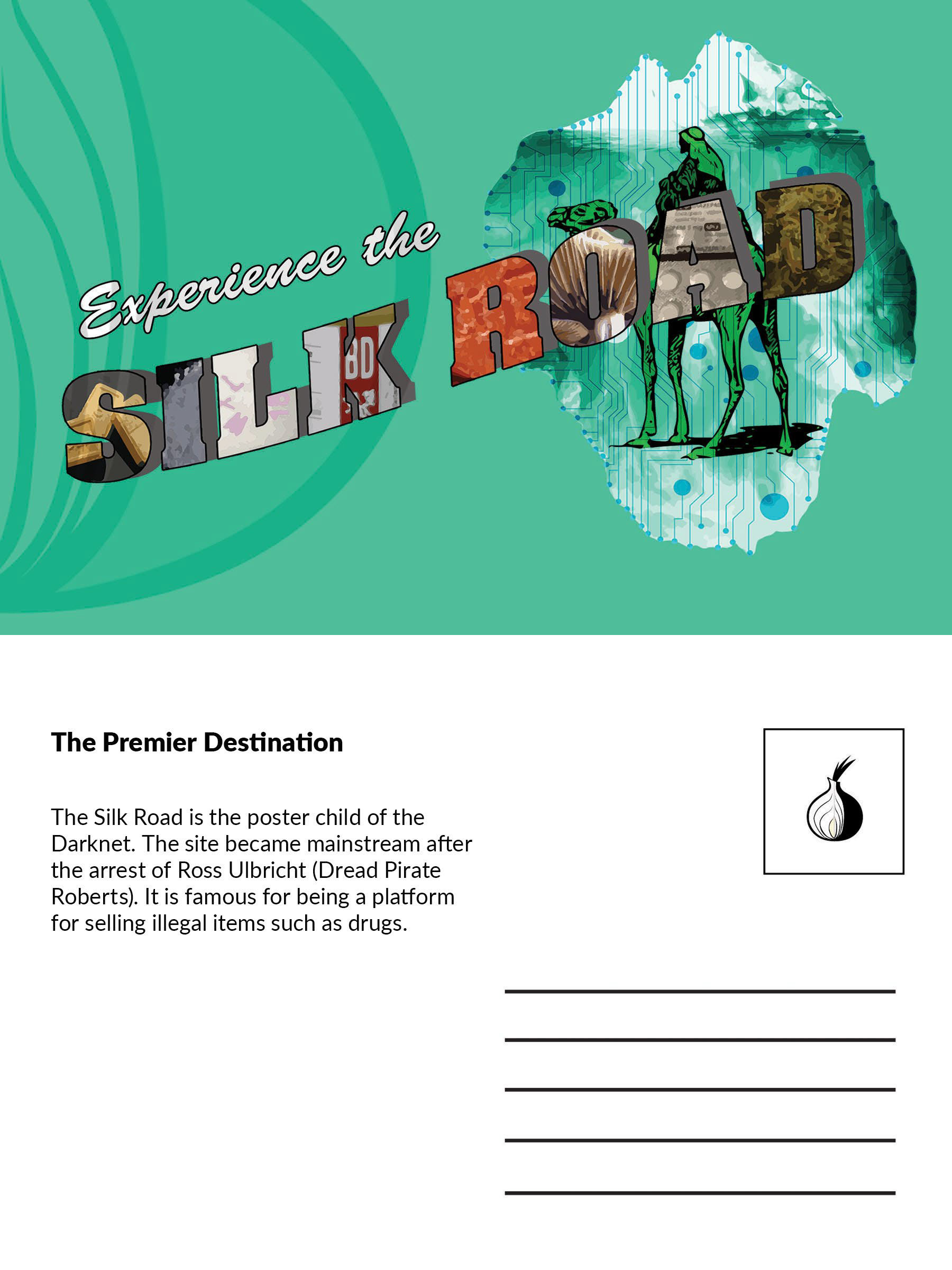
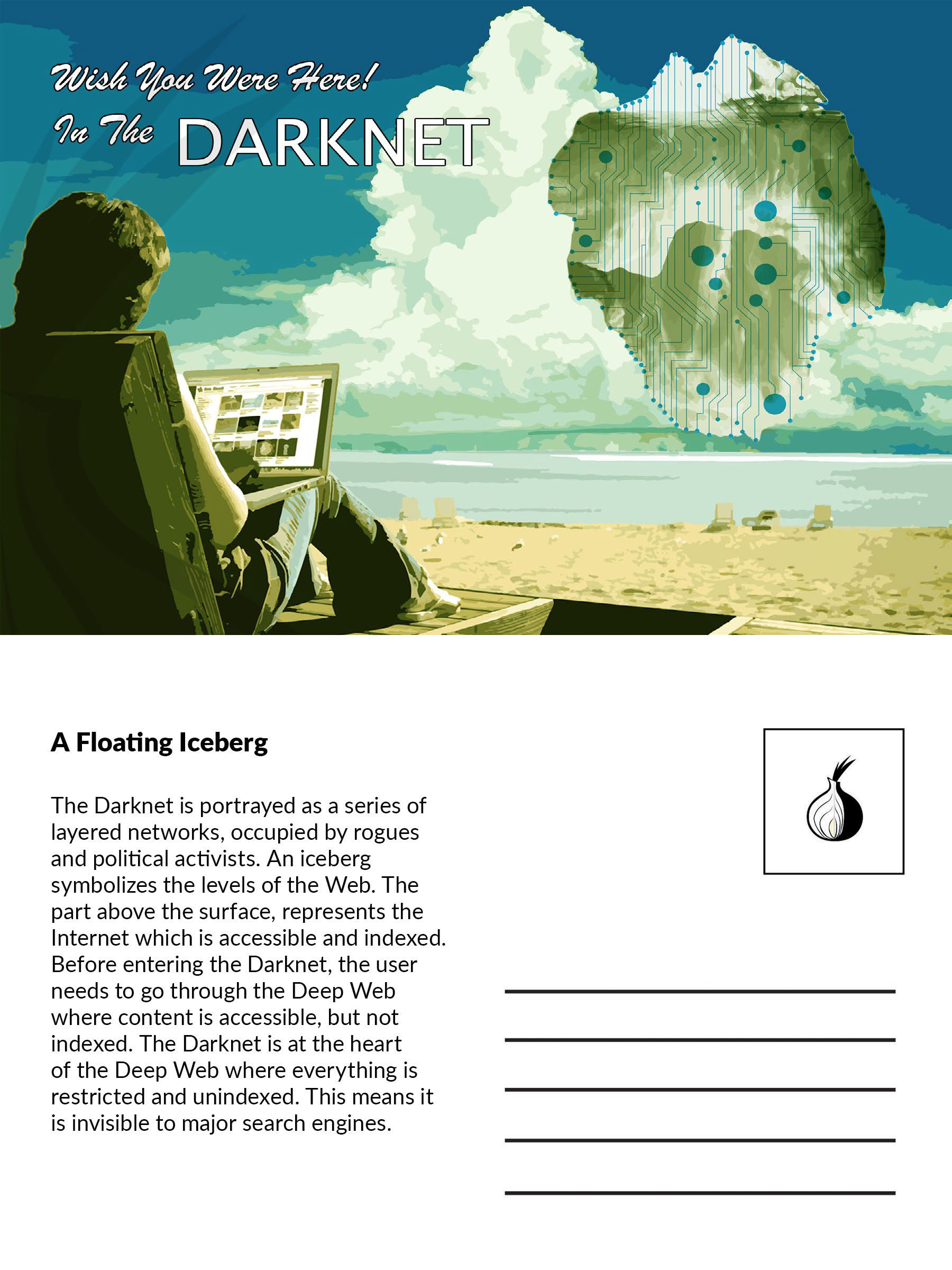
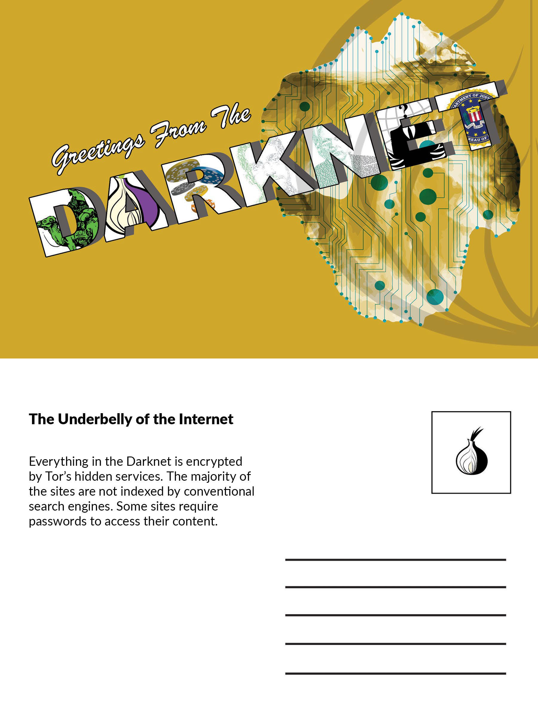
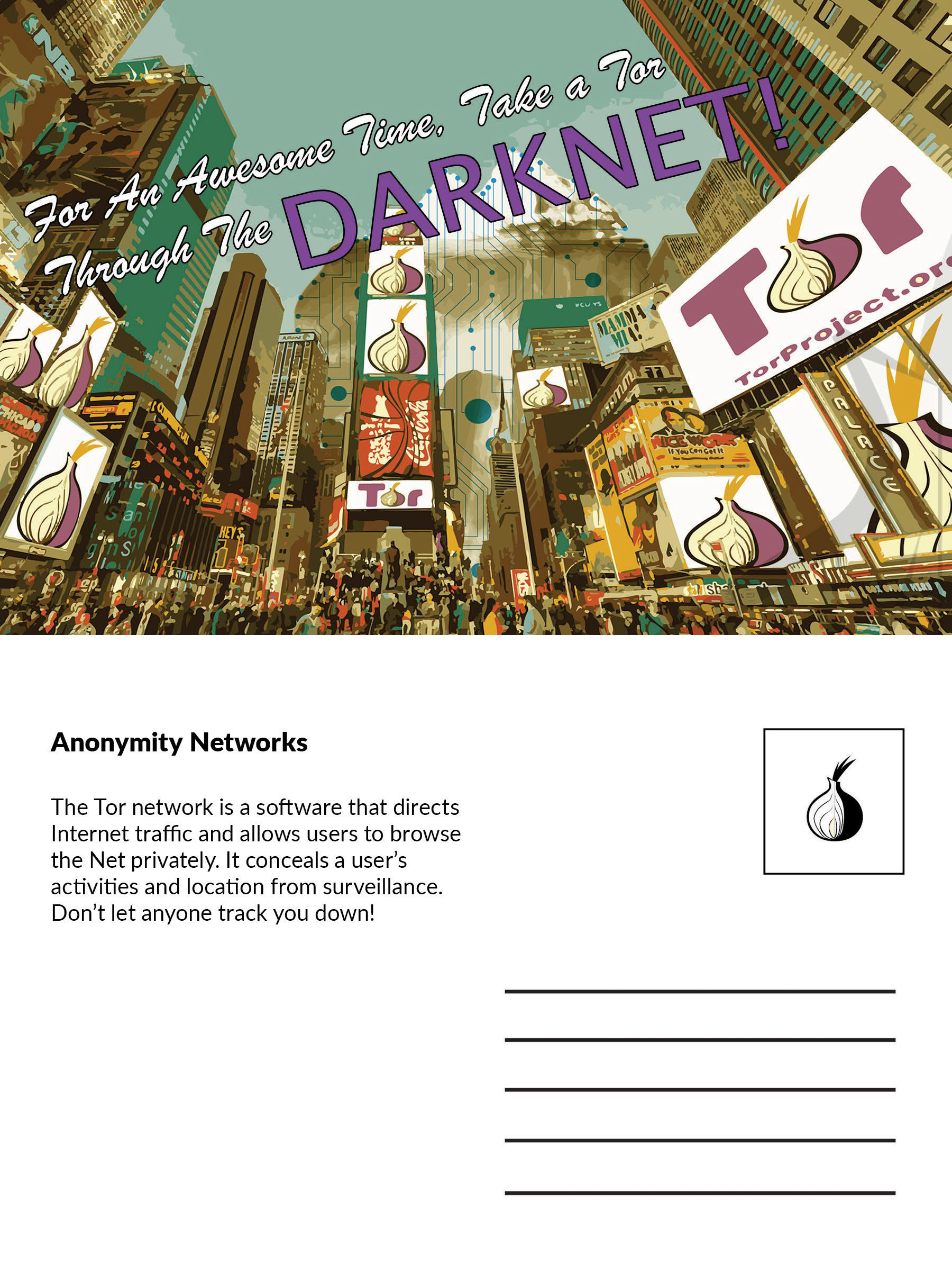
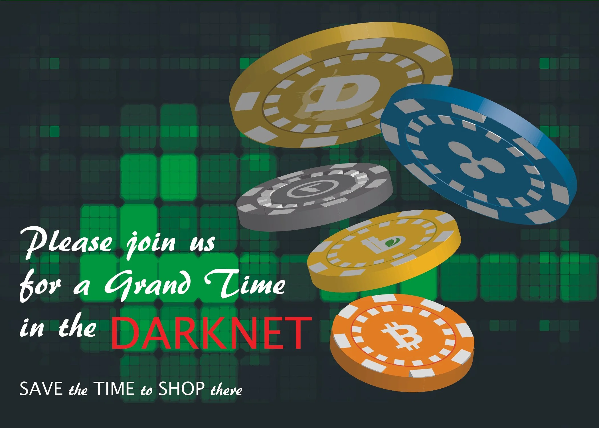
Inspired by traditional travel postcards and destination advertising, I developed a series of early postcard concepts exploring bold typography, imagery, and satirical travel themes. Each design reimagined the Darknet as an unconventional tourist destination, blending familiar travel aesthetics with the mysterious and often misunderstood world of the Darknet.
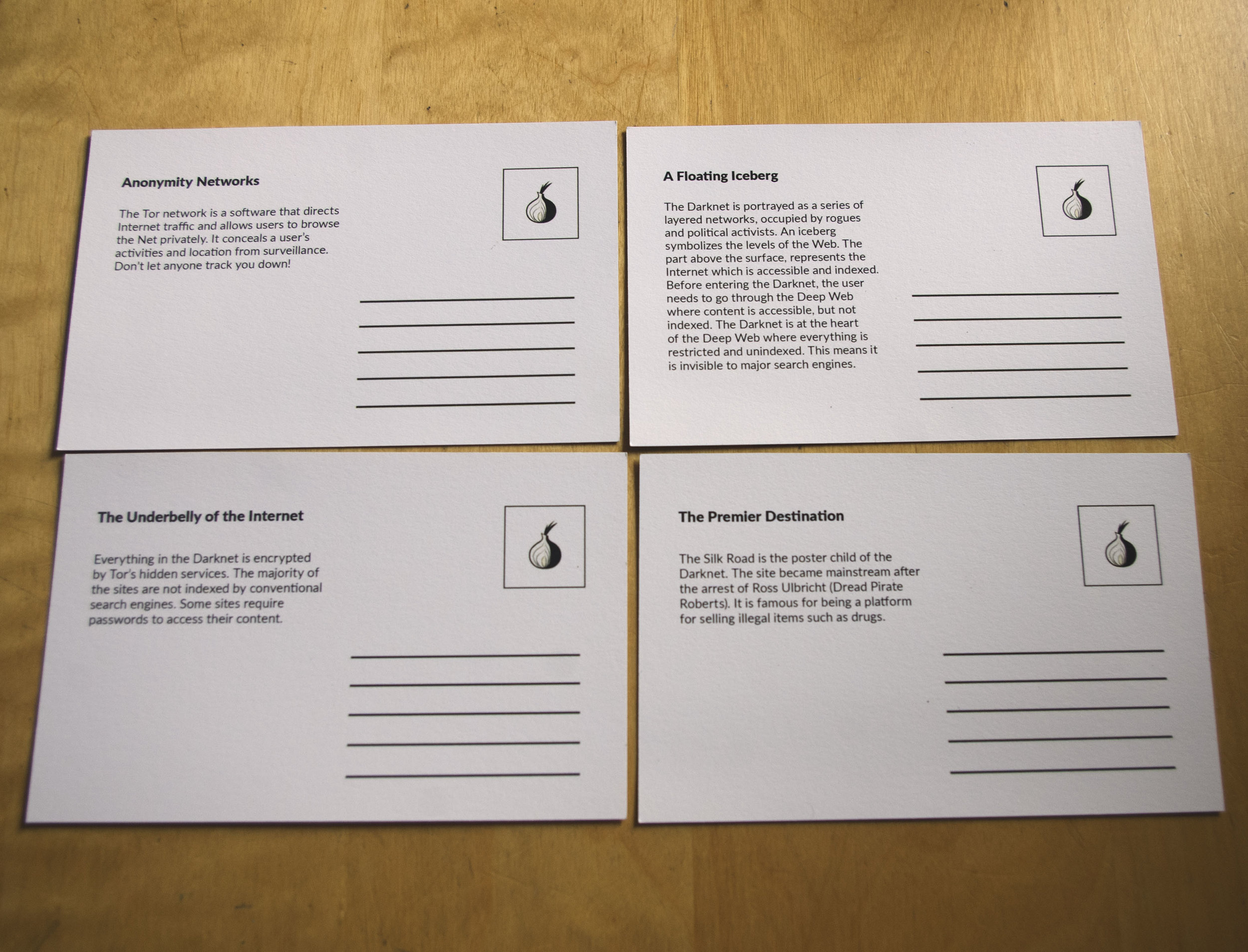
Through multiple design iterations, I refined the concepts into four final printed postcards for the gallery exhibition. Visitors were invited to select and take home a postcard as a souvenir, extending the brand experience beyond the physical installation.



Poster Design & Exploration:
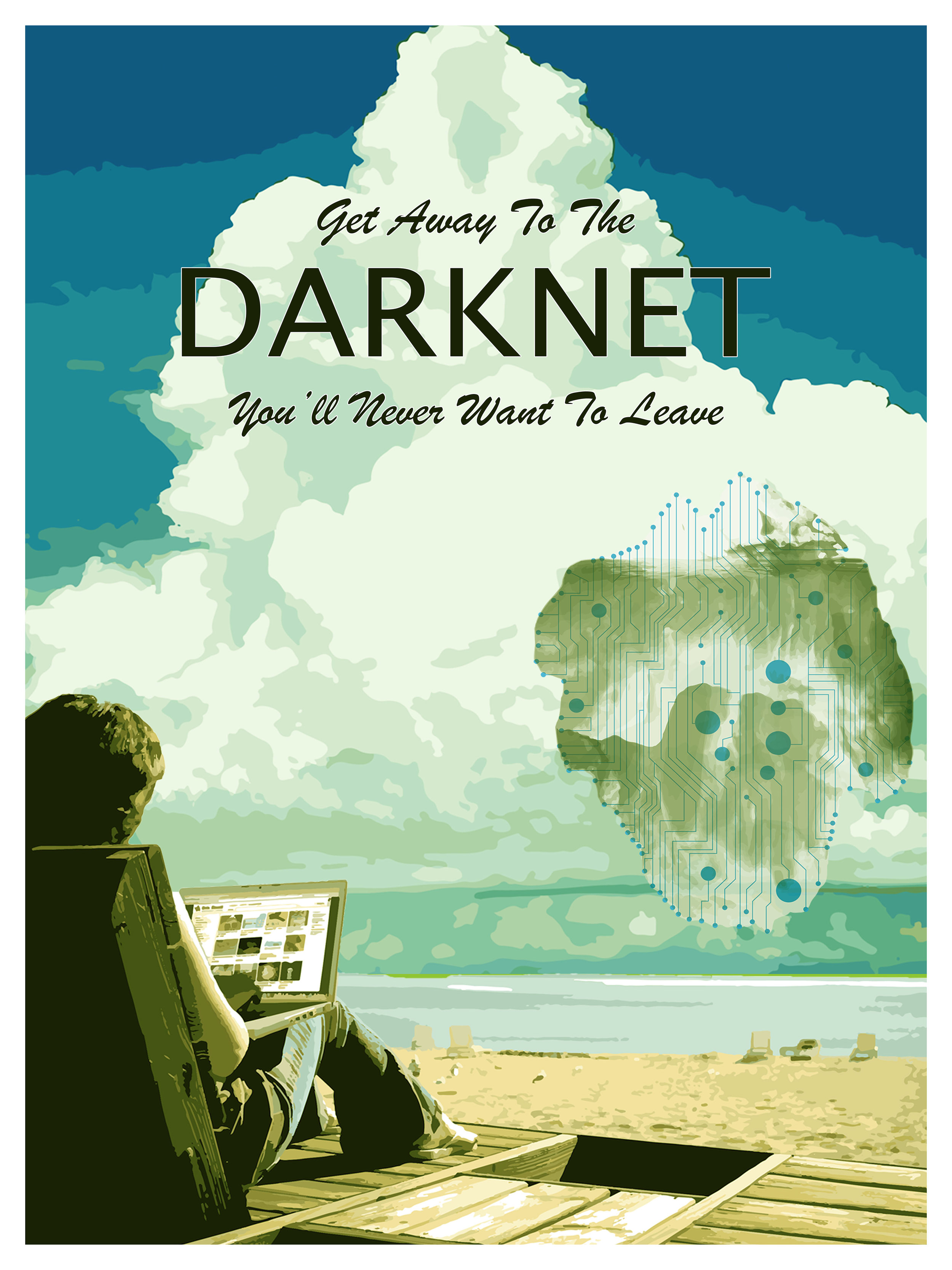
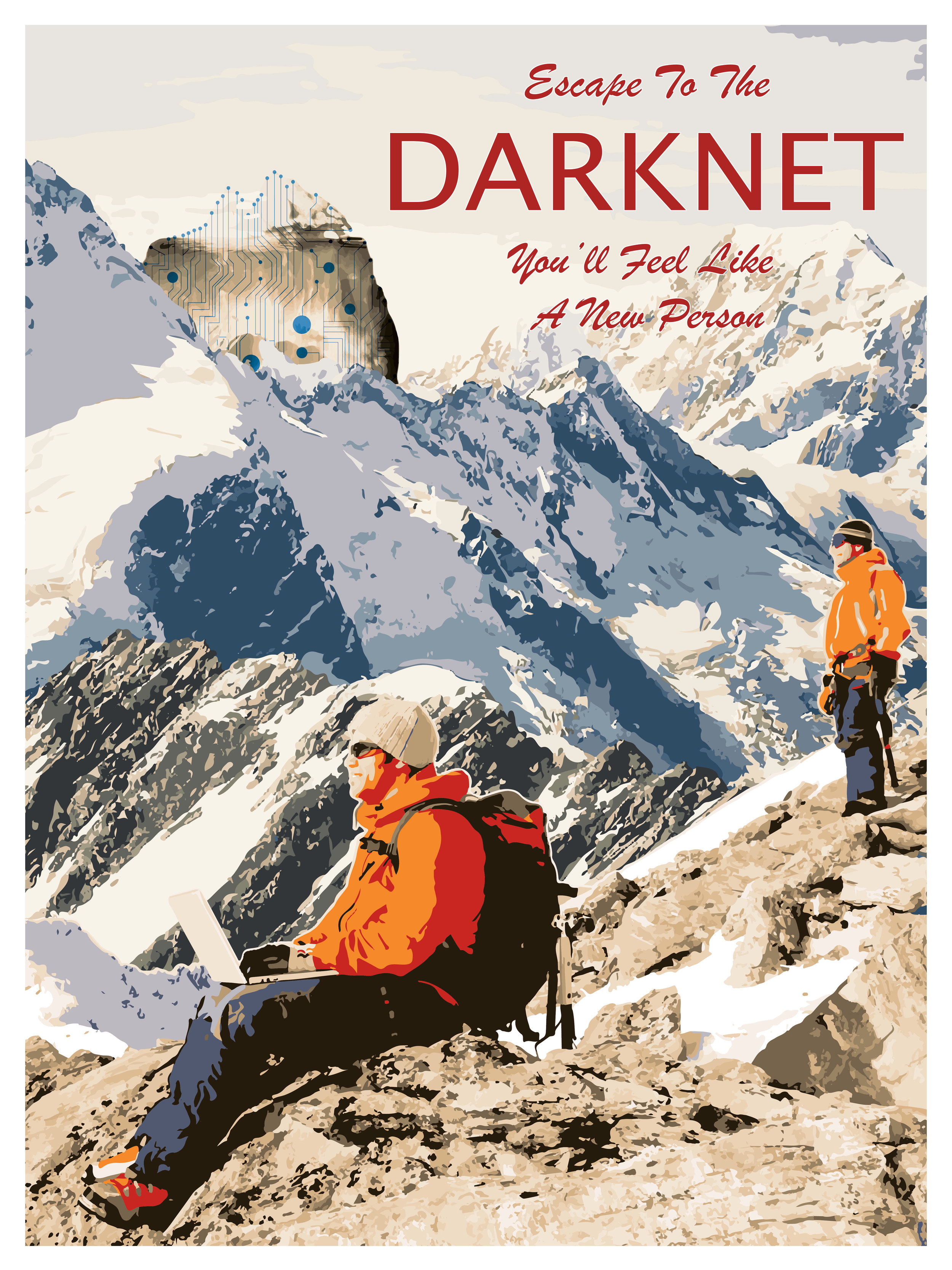
Inspired by vintage travel posters and destination advertising, I explored a series of promotional poster concepts that reimagined the Darknet as an adventurous travel destination. Each design experimented with bold typography, scenic imagery, and contrasting visual styles, blending familiar tourism aesthetics with the mysterious and unconventional nature of the Darknet.
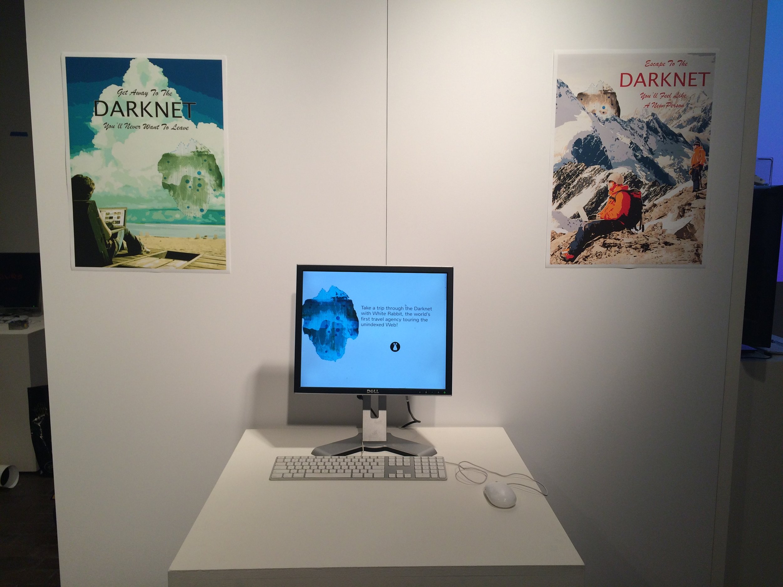
Through multiple design iterations, I refined the concepts and selected two final posters that best reflected White Rabbit's visual identity, playful tone, and overall aesthetic. These posters were printed and displayed during the gallery exhibition, helping bring the fictional travel agency to life through immersive visual storytelling.


Early poster concepts exploring vintage travel aesthetics, typography, and scenic imagery before selecting two final designs for the gallery exhibition.
Gallery Exhibition & Final Deliverables:
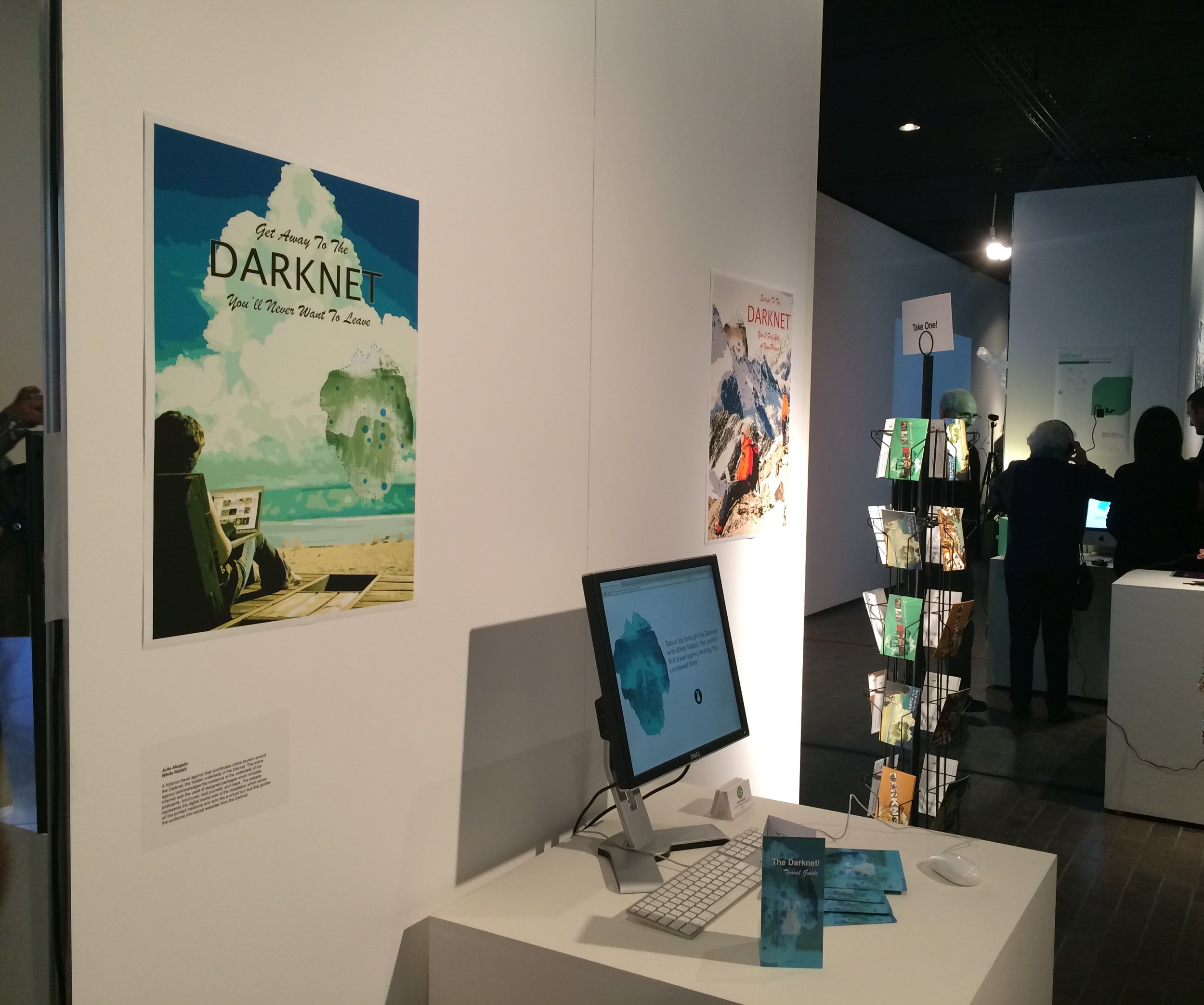
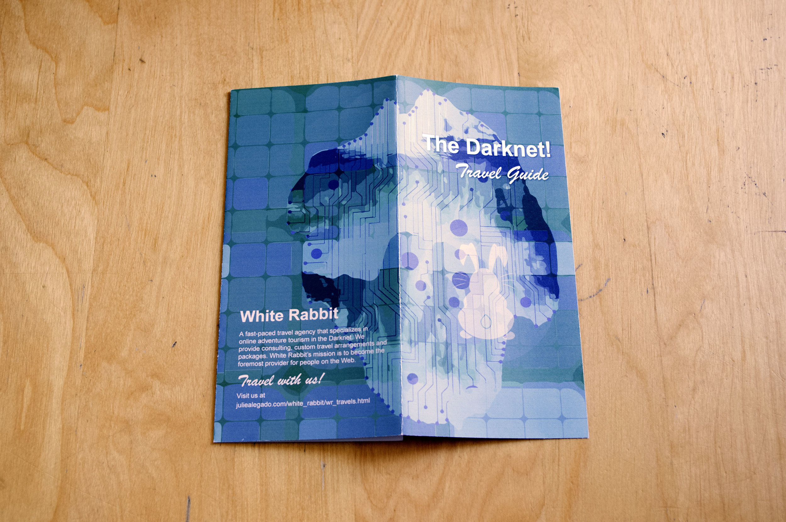
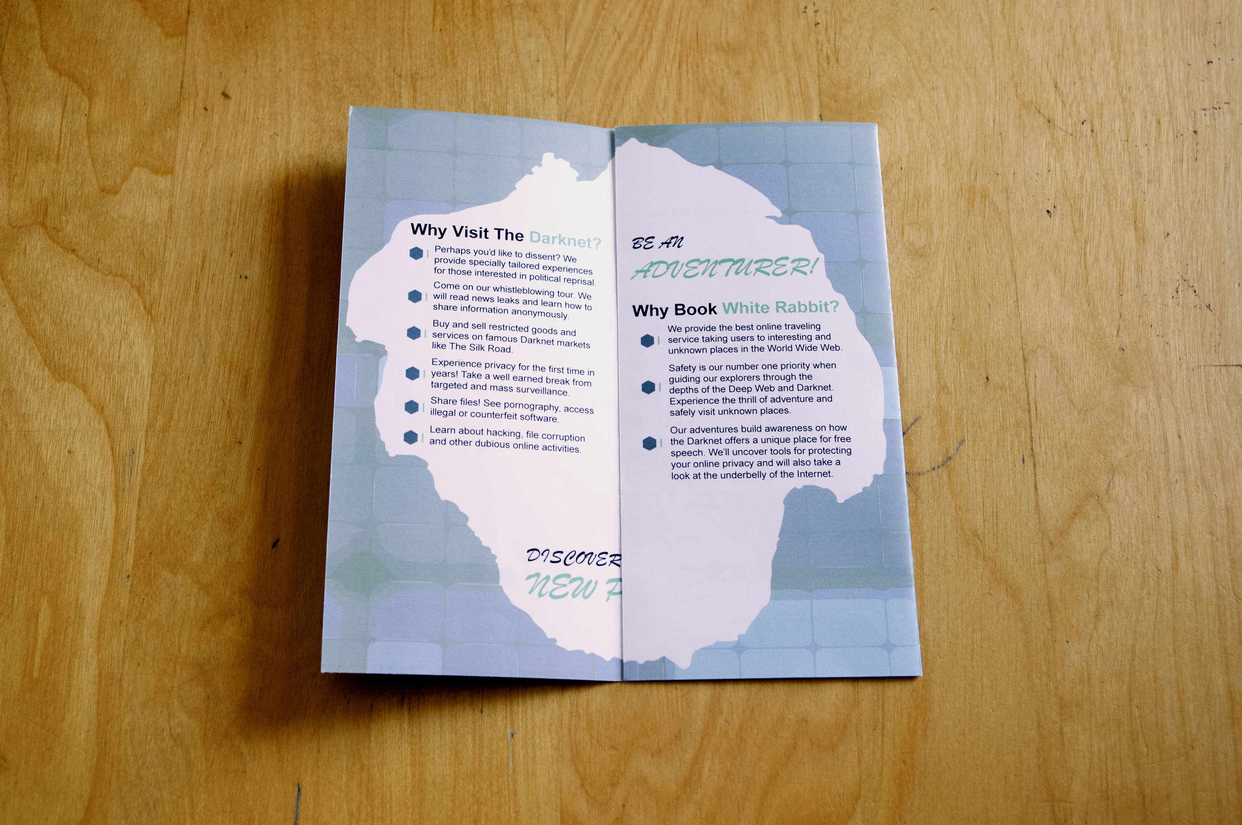
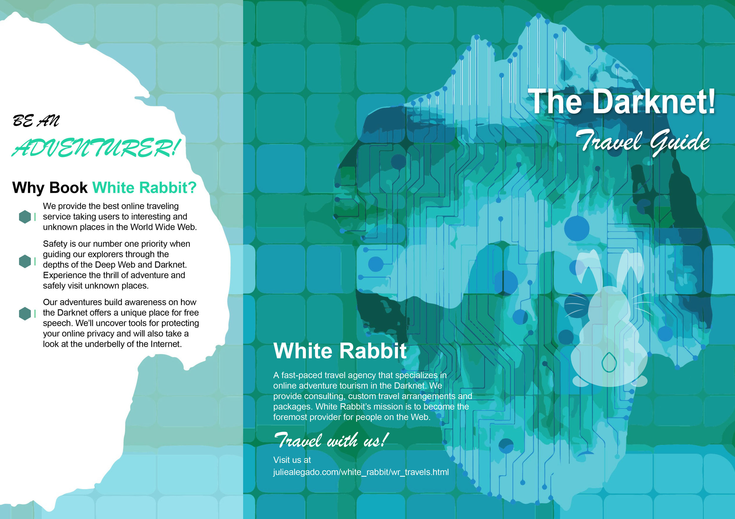
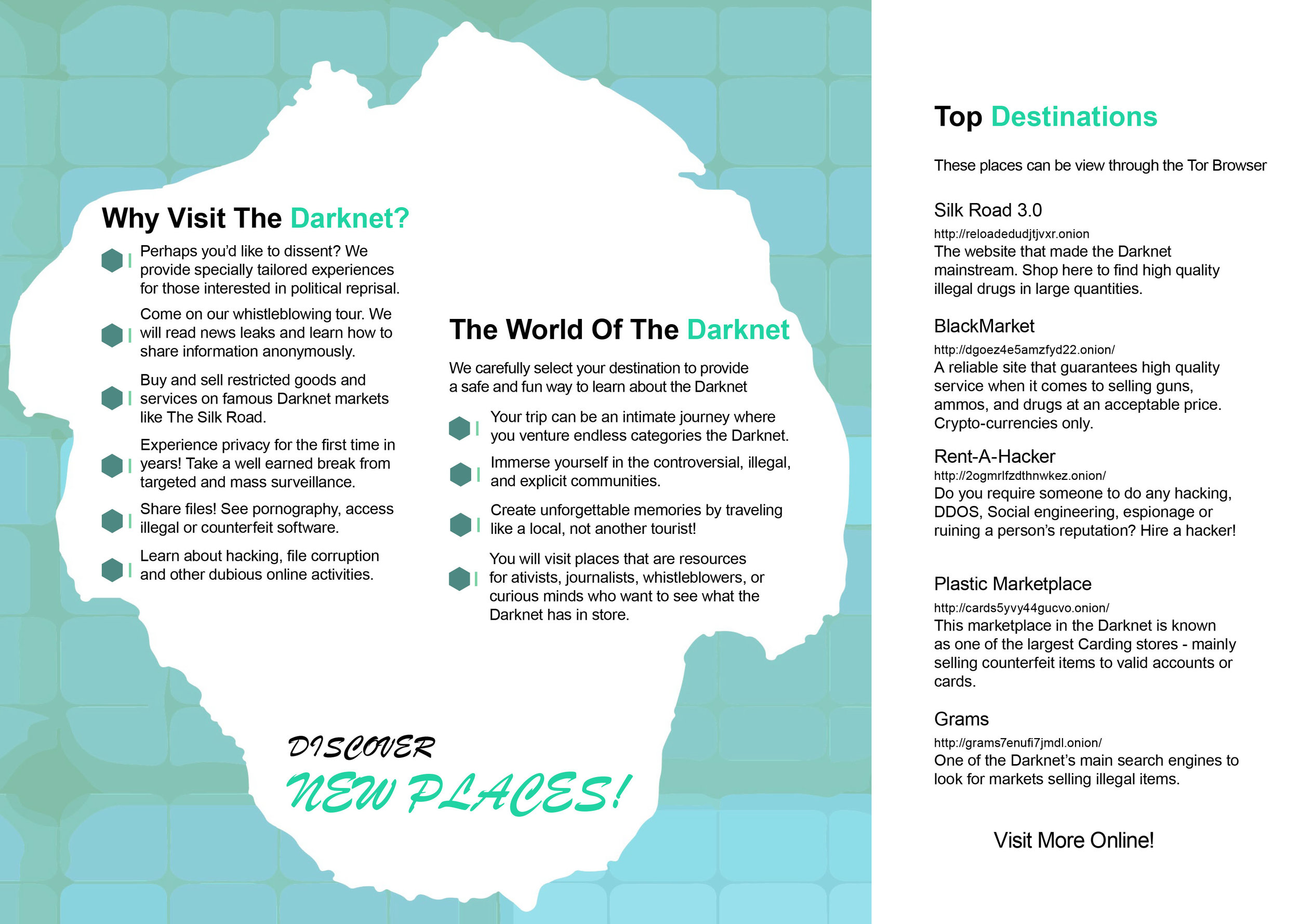
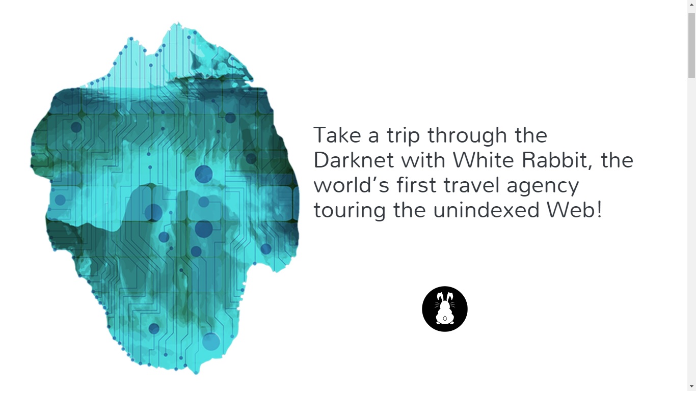
The White Rabbit project culminated in an immersive gallery exhibition, bringing the fictional travel agency to life through large-format posters, printed brochures, postcards, and an interactive website. The final installation combined physical and digital media, creating a cohesive brand experience that blurred the line between fictional tourism and real-world exploration.
The gallery documentation showcases the final printed materials and exhibition setup, including a travel brochure, promotional posters, digital displays, and take-home souvenirs. Visitors were invited to explore the fictional agency, interact with its promotional materials, and collect postcards, transforming the project into a tangible, engaging, and memorable brand experience.